About the project
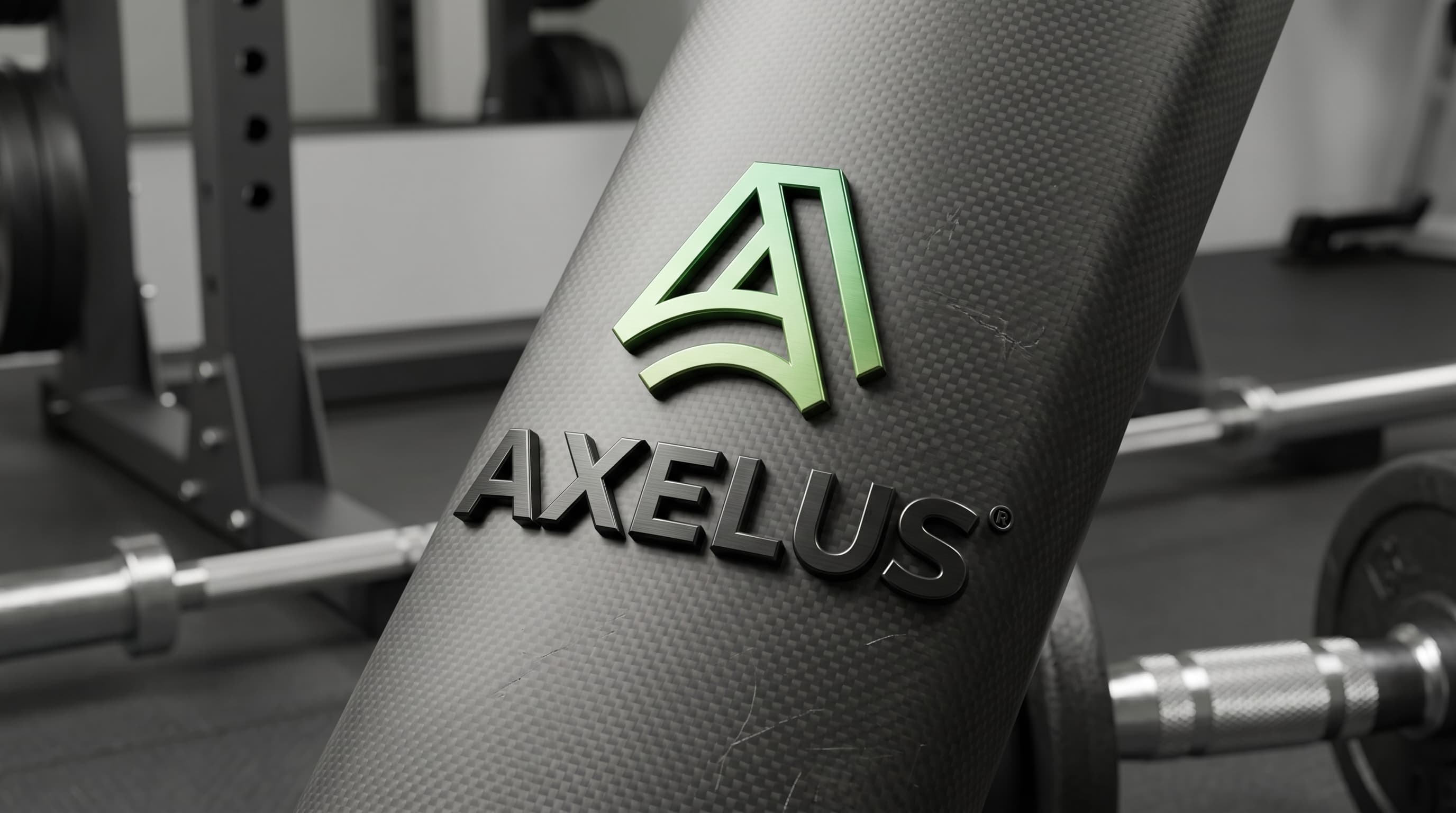
Axelus is a brand of sports equipment and fitness gear. The project involved developing a brand name and complete visual identity system: logo, mark, typography, and brand palette. The name "Axelus" is built on the association with "axis" and the Latin suffix "-us," which gives it a sense of core strength, support, and classical athletic power. The name is easily pronounced across different languages, reads well in international markets, and sounds both energetic and substantial—much like the product itself. The mark is constructed around the letter "A" executed as a peak—a symbol of achievement, personal records, and upward movement. Parallel lines within the mark create a sense of dynamics, progress, and continuous training, while the arc at the base establishes stability and balance—key qualities of reliable fitness equipment. A green gradient from rich emerald to fresh grass green conveys energy, health, and growth; a dense geometric sans-serif typeface in "AXELUS" reinforces a sense of strength and technological sophistication. The logo was developed in two layouts—vertical and horizontal—allowing confident application across equipment, packaging, digital channels, and retail environments.
Results
A brand was created from scratch—from naming to a cohesive visual system. The identity confidently works across equipment, packaging, and digital channels, establishing clear positioning in the sports equipment and fitness gear segment.
Services delivered
- Naming
- Brand strategy
- Logo design
- Corporate identity
- Typography system
- Brand palette
- Brand guidelines
Like this project?
Start a similar project ↗