About the project
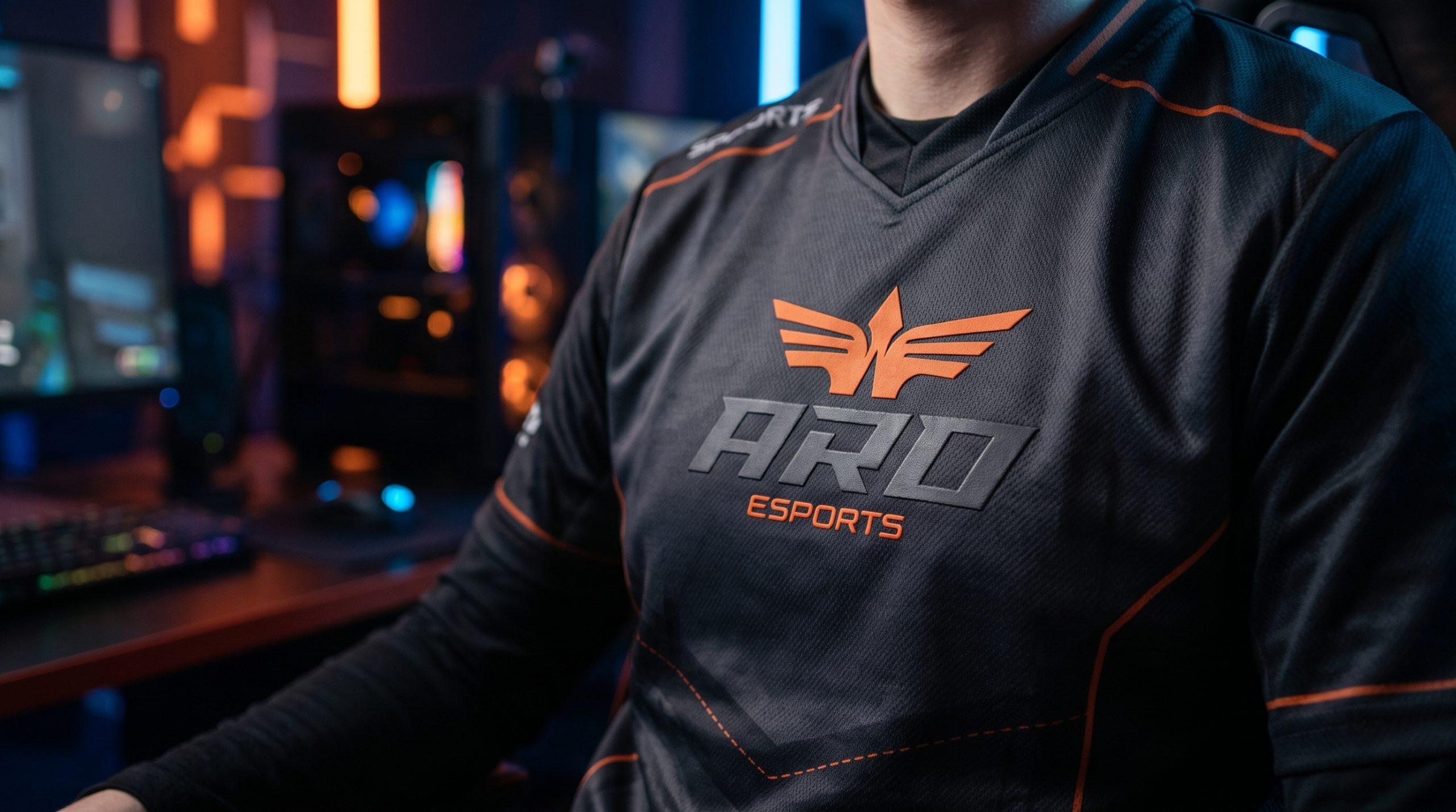
ARO Esports is a competitive esports team competing on the professional scene. The project involved developing a brand name and complete visual identity: logo, mark, typography, and brand color palette. The name "ARO" is an acronym for Absolute Rising Organization, embodying the team's core philosophy: constant growth, upward momentum, and pursuit of absolute excellence. The concise three-letter name is easy to chant from the stands, convenient for player tags in matches, and sounds equally strong in any language—essential for a brand on the international esports stage. The mark features spread wings with a sharp apex at the center. The composition reads as the takeoff of a predatory bird, symbolizing victory and dominance over opponents. The central arrow pointing upward directly visualizes "Rising" from the brand name, while the inner wing lines form the silhouette of the letter "A"—the brand's initial. The orange gradient from bright flame to deep red-orange conveys passion, energy, and competitive intensity. Black in the "ARO" wordmark establishes strength and character edge. Custom letterforms with forward slant and sharp cuts create a sense of speed and attack, while the technological descriptor typeface "ESPORTS" references the digital environment and gaming interfaces. The logo performs confidently on esports jerseys, social media avatars, stream overlays, tournament banners, merchandise, and in-game player tags.
Results
A brand built from the ground up—from naming to a cohesive visual system. The identity establishes the image of an ambitious and aggressive team, performs effectively in gaming environments, on streams, jerseys, and merchandise, and is ready to scale across new disciplines and international tournaments.
Services delivered
- Naming
- Brand Strategy
- Logo Design
- Brand Identity
- Typography System
- Brand Color Palette
- Brand Guidelines
Like this project?
Start a similar project ↗