Category
Branding
Tags
About the project
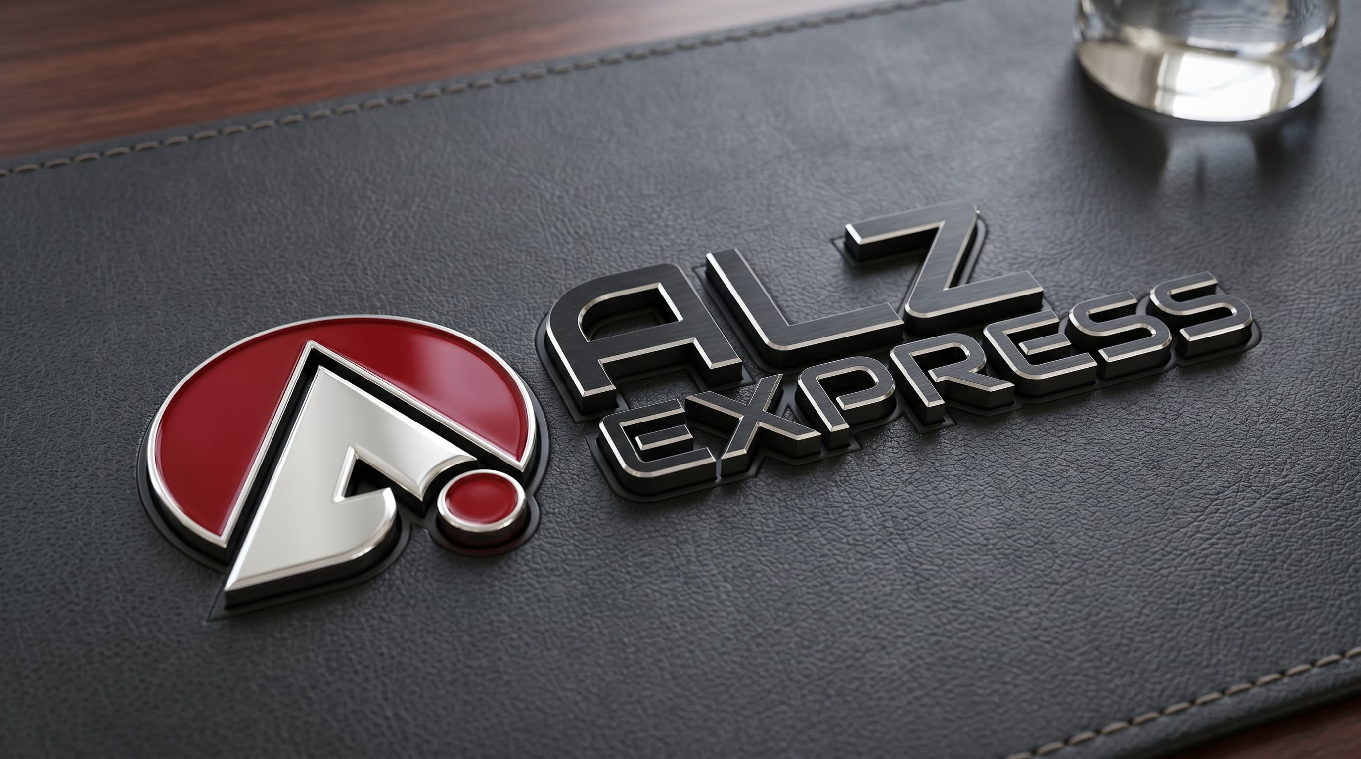
ALZ Express is a US-based transportation and logistics company operating in the freight transportation segment. The project involved developing a comprehensive brand identity: logo, mark, typography system, and color palette. The mark's foundation is a stylized letter «A» in the form of an arrow inscribed within a red circle. This composition directly communicates movement, speed, and reliability — key qualities of a trusted carrier. The red dot at the base of the mark serves as an accent and visual marker — symbolizing a «point on the map», delivery confirmation, and punctuality. The palette is built on the contrast between deep black and saturated red: black conveys seriousness and technical solidity, while red projects energy and visibility — essential for truck sides, trailer panels, and digital channels. The sans-serif «technical» typeface with distinctive cutouts in letterforms emphasizes the industrial character of the brand and reinforces associations with transportation and motion. The logo performs equally well in large formats — on truck sides and signage — and at small scales on documents, business cards, and digital media.
Results
A recognizable, «road-ready» visual identity has been established that works confidently across freight vehicles, documentation, and the company's digital channels. The brand now has a cohesive identity system, ready to scale across the fleet and corporate materials.
Services delivered
- Brand strategy
- Logo design
- Brand identity
- Typography system
- Brand color palette
- Vehicle design
Like this project?
Start a similar project ↗