Категория
Ребрендинг, Брендинг
Теги
О проекте
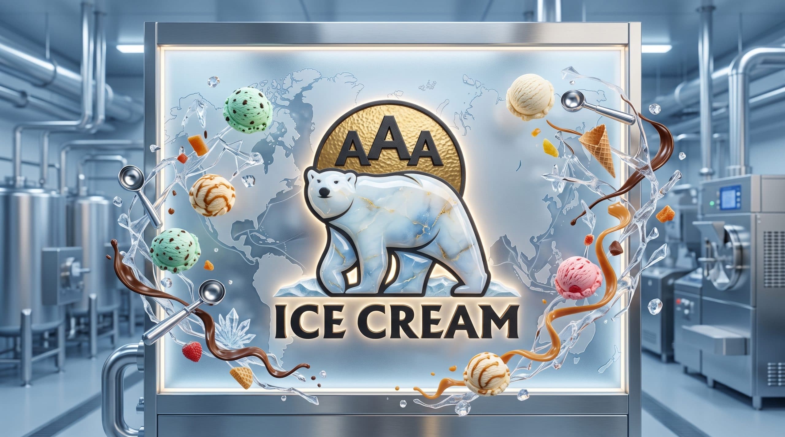
AAA Ice Cream — узбекский производитель мороженого. В рамках проекта был проведён полный ребрендинг: разработан новый логотип, маскот, типографика и фирменная палитра. Прежний визуальный образ уже не отражал масштаб и амбиции компании. Задача ребрендинга — создать сильный, запоминающийся и конкурентоспособный бренд, который уверенно стоит рядом с международными игроками рынка мороженого. В основе нового знака — белый полярный медведь на фоне золотого круга. Медведь — безусловно сильнейший маскот для бренда мороженого: он олицетворяет арктический холод, кристальную чистоту льда и природную мощь. При этом иллюстрация выполнена в серьёзном, фирменном стиле — не мультяшном, а характерном: медведь идёт уверенно, с достоинством, как и подобает бренду с именем AAA. Золотой круг за фигурой медведя работает сразу на нескольких уровнях: это солнце — источник тепла и радости, которую дарит мороженое в жаркий день; это медаль — символ высшей награды за качество; и это ореол, придающий маскоту статус и премиальность. Аббревиатура «AAA» — triple-A — в любой системе оценки означает высший рейтинг. Именно это обещание бренд даёт покупателю с первого взгляда на логотип. Жирный антиквенный шрифт «ICE CREAM» добавляет монументальность и классический характер — бренд не гонится за трендами, он устанавливает собственный стандарт.
Результаты
Проведён полный ребрендинг: компания получила сильный маскот и визуальную систему, соответствующую уровню крупного производителя. Новый образ формирует доверие у покупателей и уверенно работает на упаковке, торговом оборудовании, транспорте и в digital-каналах.
Оказанные услуги
- Ребрендинг
- Разработка логотипа
- Маскот
- Типографическая система
- Фирменная палитра
- Брендбук
Понравился проект?
Начать похожий проект ↗